Risk Visualizer
Interactive geospatial dashboards pinpoint policy exposure zones and aggregate portfolio risk metrics, enabling insurers to optimize underwriting and capital allocation.
Interactive geospatial dashboards pinpoint policy exposure zones and aggregate portfolio risk metrics, enabling insurers to optimize underwriting and capital allocation.
How does it work?
Insurers often lack detailed spatial insights into policy concentrations, increasing vulnerability to correlated losses in severe events. Our platform leverages AI-driven geospatial analytics to map exposures at high resolution, improving risk diversification and capital efficiency.
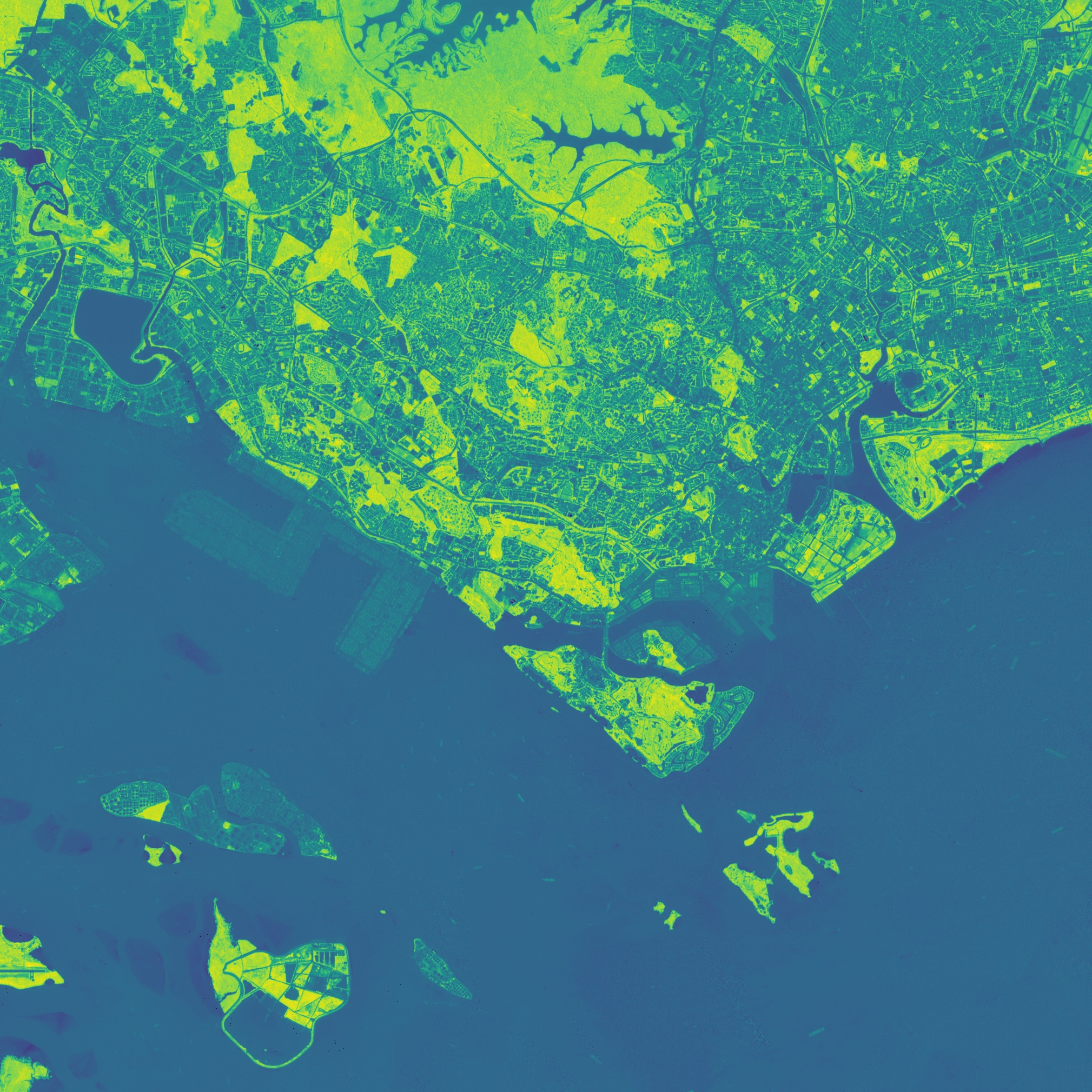
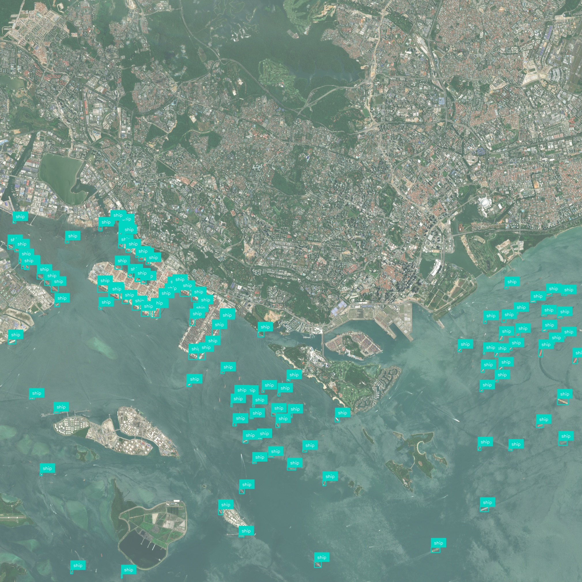
AI processes satellite and address-level data to visualize exposure zones down to the parcel. This precision uncovers hidden concentrations and supports targeted underwriting decisions.
Aggregates hazard, exposure, and vulnerability into customizable risk scores in real time. It empowers underwriters to compare scenario impacts across regions and portfolios instantly.
Runs stochastic event models and stress tests on your portfolio using geospatial probability layers. Users can assess financial impact under various peril intensities before binding policies.
Combines individual policy geolocations into portfolio-level heatmaps and exposure curves. This consolidated view simplifies capital allocation and reinsurance planning.
Automated data feeds update exposure maps as new policies are bound or amended. Alerts flag emerging risks from weather forecasts or hazard changes, keeping risk managers proactive.
Generates standardized reports and visualizations aligned with Solvency II and NAIC requirements. Exportable dashboards and audit trails streamline regulatory submissions and internal reviews.
Have a different question and can’t find the answer you’re looking for? Reach out to our support team by sending us an email and we’ll get back to you as soon as we can.
Geospatial AI Platform
AI & foundation models
Deep-learning and foundation models turn raw imagery into ready-to-use insights, so you ship answers instead of training pipelines.
Conversational workflow
Ask questions in plain language and the platform responds with charts, visualizations, and next step suggestions.
GPU-accelerated cloud
Cloud-native architecture spins up on-demand GPU clusters that scale from a single scene to global archives—no manual ops, no bottlenecks.
Any sensor, any format
Optical, SAR, drone, IoT, vector or raster—ingest, fuse, and analyze without conversion headaches.
Insight you can see
Real-time 2D / 3D maps and export-ready plots make results clear for engineers, execs, and clients alike.
Turn satellite, drone, and sensor data into clear, real-time insights using powerful AI – no complex setup, just answers you can see and act on.